
Product Manage
Manage (acquired by Siemens) is an industrial-scale platform to manage lighting systems and energy consumption of a building. For Siemen's field engineers, the platform is the primary interface for bringing massive buildings "to life" at the time of construction.
Details
Web-based tool
surface
Product Designer (individual designer)
project managed by Twist Open UX
1 Product Manager∙1 Front-end Dev ∙2 Back-end Devs
team members
UX/UI ∙ User Testing ∙ Design System
scope
Problem The Commissioning Bottleneck
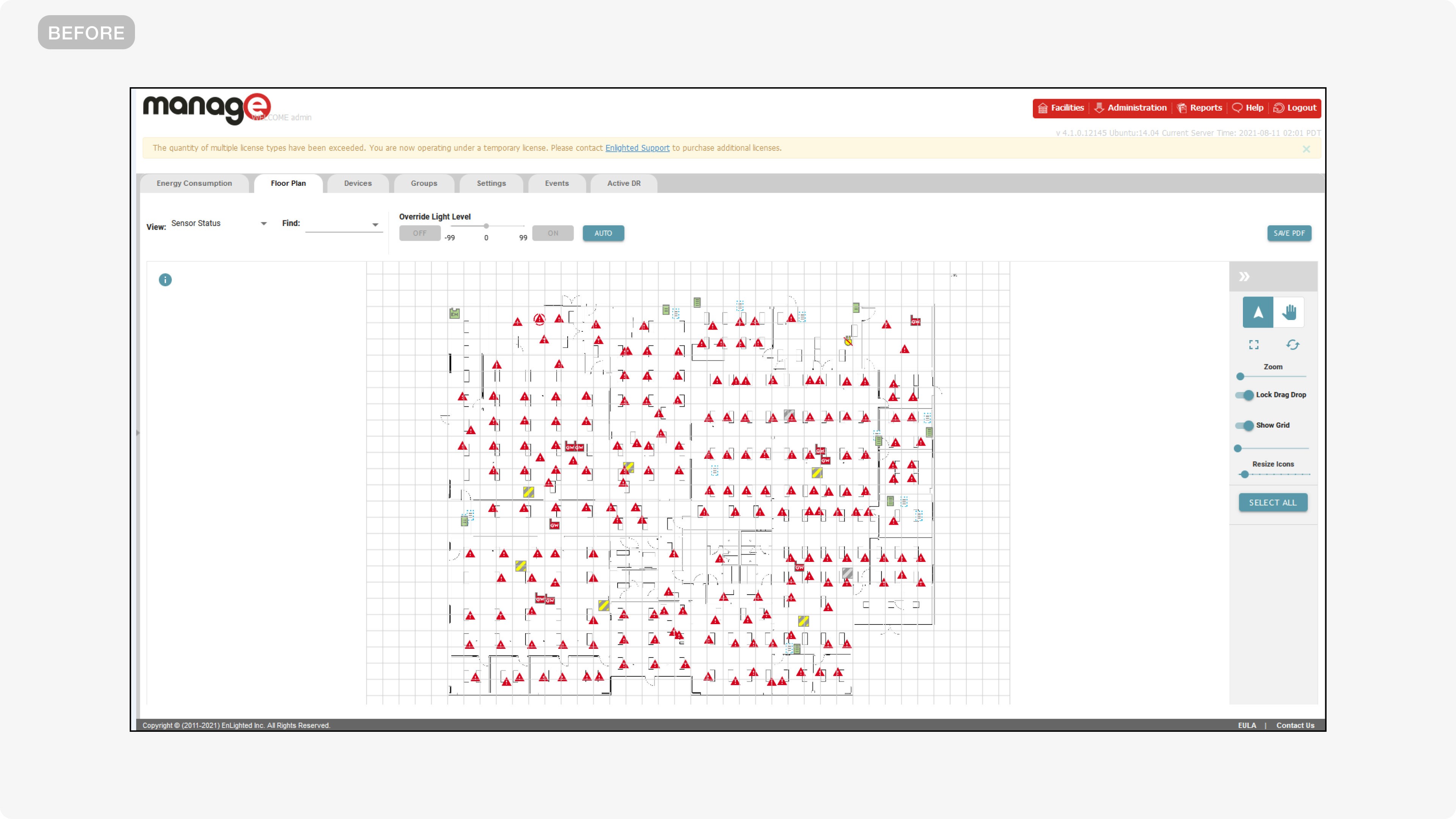
The legacy interface was a "wall of data" that lacked visual hierarchy and flow. Field engineers were forced to navigate a high-friction setup process where connecting fixtures was slow and unintuitive, leading to a 5-day commissioning lag per building and frequent installation errors.
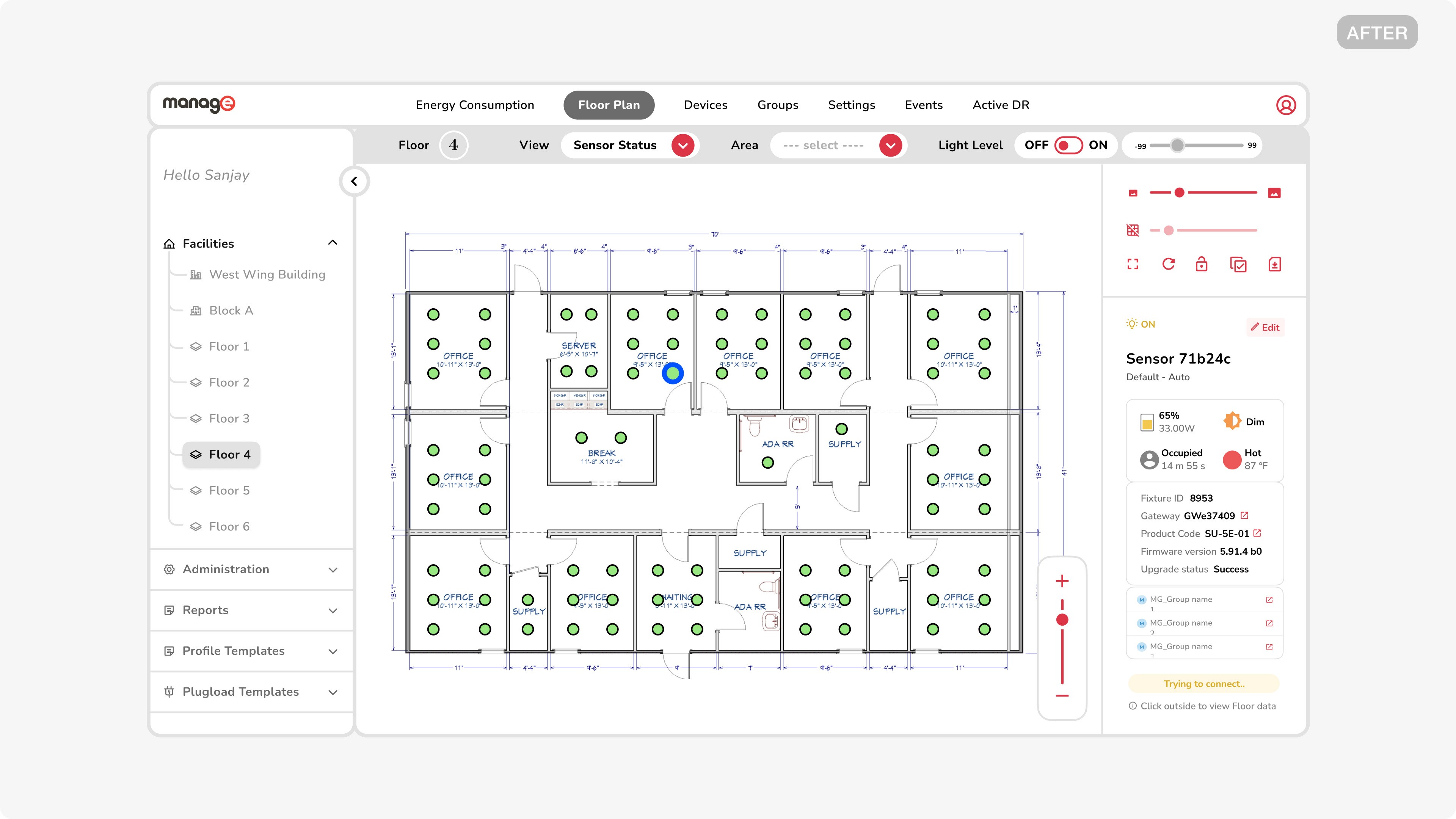
Solution A Streamlined Interaction Model
I redesigned the core commissioning workflow, introducing a collapsible navigation system and a refined visual language. By balancing high-density data with a minimalist UI, the new model allowed engineers to process installations with significantly less cognitive strain.
Result A Faster Setup
The redesign cut the commissioning cycle from 5 days to 2. The new interface achieved 100% adoption among building managers, drastically reducing error rates during hardware pairing and saving hundreds of manual labor hours per project.
Impact
5
2
Accelerated the commissioning cycle by 60% through a streamlined interaction model.
100%
Eliminated manual coordinate entry errors by implementing a direct drag-and-drop fixture placement model.
+25%
Recovered through a collapsible sidebar, allowing engineers to navigate high-density floor plans without scrolling.
CONTEXT
Siemens is a technology leader focused on automating a building's energy consumption using smart sensor-based lights.
PROBLEM
Field engineers' productivity was bottlenecked by a wall of data and lengthy interaction flows that slowed every commissioning job
GOALS + NORTH STAR
To design a high-density industrial interface that feels as intuitive as a consumer app, giving the platform a modern visual/ui facelift while enabling engineers to commission smart infrastructure with zero friction.
PROCESS + KEY INSIGHTS
SOLUTION
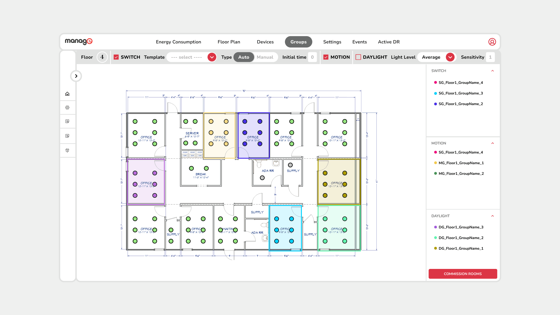
DESIGN 1/3
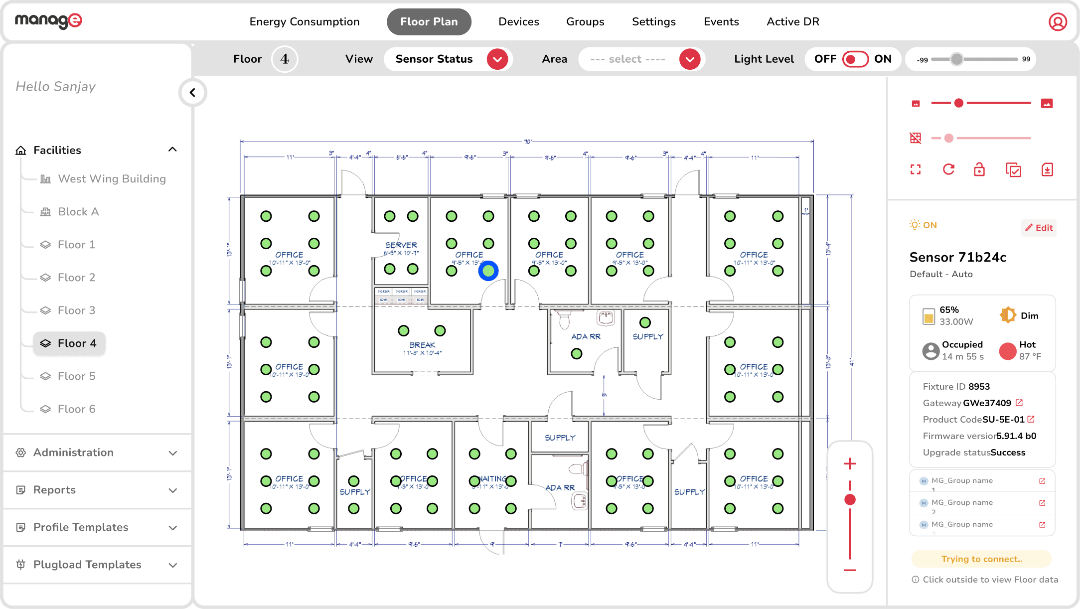
The Fixture Info Panel
info visible when needed

DESIGN 2/3
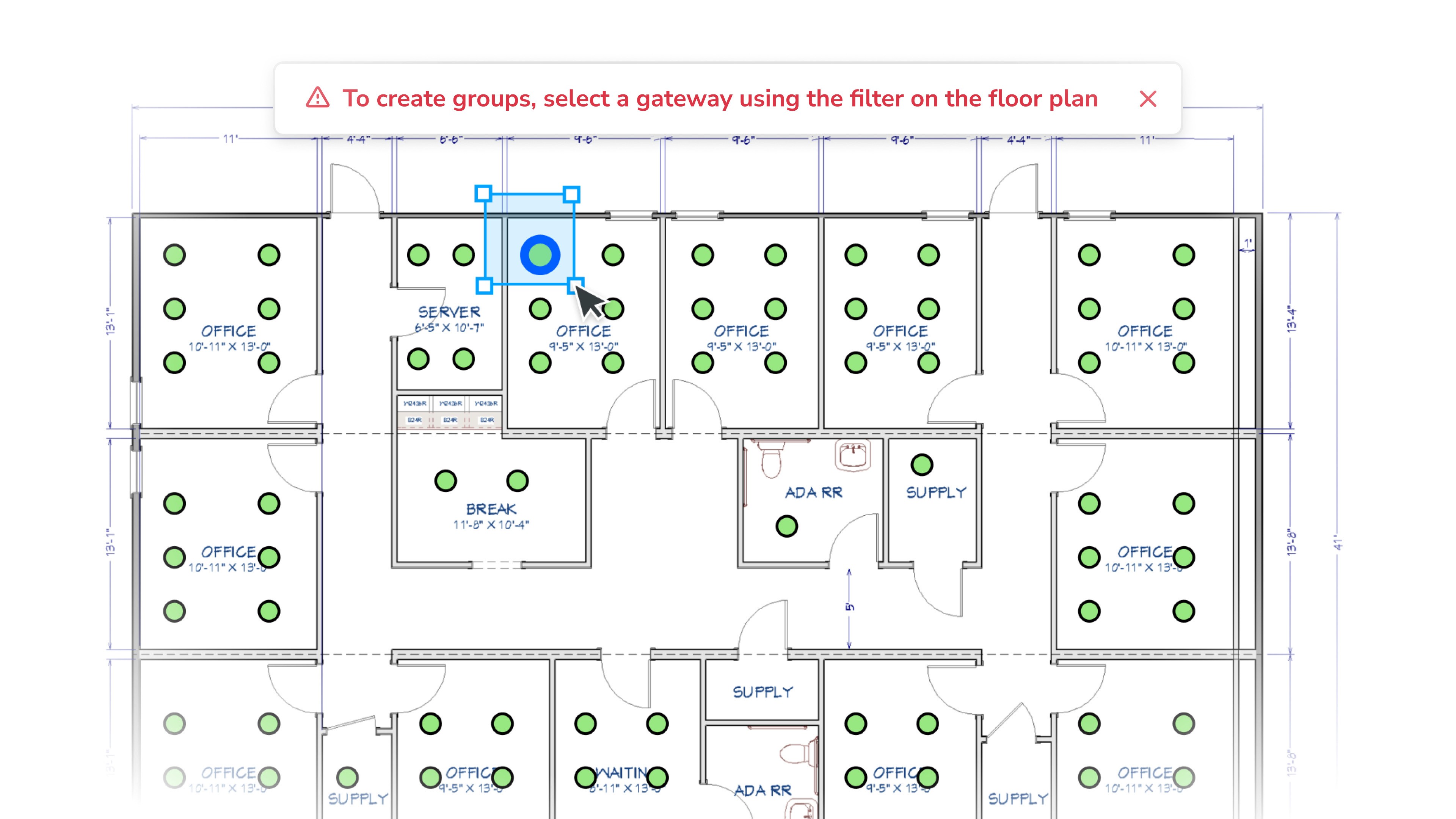
The Drag-to-Group Selection Interaction
replacing click marathons with direct selection
DESIGN 3/3
Sticky Information Strips
a guide for a new flow
HOW I'D REDESIGN TODAY..
Introduce AI-assisted predictive grouping
Smart-building automation is one of the fastest-growing areas where AI is being applied to spatial reasoning. Leveraging it, I'd focus on introducing AI-assisted predictive grouping by training a model on floor-plan geometry to map fixtures to geo-fenced room boundaries automatically. Partnering with dev engineers, this would enable field engineers to commission an entire room's worth of light fixtures in a single click, collapsing one of the workflow's most repetitive bottlenecks into a moment.
Siemens' super efficient field engineers lived happily ever after
fin.